
Web Enrolment System (WES) Usability Analysis - A Report
Project type
-
UX Research
-
Usability Analysis
-
Client Report
Tools
-
Figma
-
FigJam
Research duration
12 weeks
Team
-
Jing Ye
-
Linh P. Hoang
-
Nipun Gakkhar
-
Ouyseang Liv
My contribution
-
Define Target Users and Tasks
-
Facilitate Testing
-
Data Synthesis
-
Data Analysis
-
Documentation
-
Presentation
Web Enrolment System (WES) is the central platform for course registration for Monash University students.
However, users have reported issues with its visual design and functionality, leading to confusion and decreased productivity while completing desired tasks like navigation, search, view, etc.
To address the concerns, our design team decided to conduct a user research project to assess the system’s usability and identify key areas for improvement.
This case study summarises critical findings and key data that lead to actionable insights from the research, forming a foundation for recommendations to enhance the WES experience.
About WES
Web Enrolment System (WES) is an essential website for Monash students. All students must use WES to get enrolled into their classes.

WES allows students to (1) re-enrol and manage their enrolment, (2) view fee statements and (3) payment history, (4) purchase letters and (5) academic records, (6) update personal details, (7) apply to graduate and access many more services.

This project aims to discover how the user interacts with WES, what difficulties they face when they use it, their experience, and their idea of what they expect WES to change or improve.
Homepage, Enrollment, Course Progression, Payment, and Student Services will be the main features used to conduct user testing to reach our goals.
Test Process
This project utilised a usability user testing methodology to evaluate user experience on WES.
-
Before commencing the tests, all participants will be provided a brief description of what WES is and our goals in conducting the tests.
-
Users are encouraged to use the think-aloud approach to express their experience and opinions on WES.
-
Testing Consent Forms are required to be signed by all participants in order to have their permission to record the interview as well as the testing.
-
Video recordings, observations, and note-taking about their experience are collected to ensure accuracy.

-
The tasks are created with a variety of difficulties to discover different aspects of WES’s interface and identify any encountered issues.
-
After completing all the tasks, participants are asked to do the post-survey interview for their experiences, recommendations for improvement, and any specific problems that they encountered and features they wished to have or make enhancements.
Tasks & Scenarios
As current Monash University students with firsthand experience using WES, our team identified five common tasks along with their corresponding scenarios that students frequently encounter on the platform.
The tasks are self-identified with varying levels of difficulty to explore different aspects of WES's interface and identify any issues encountered.
TASK
1
Enrolment
Check the units that you have enrolled this semester
Scenario: You want to check which units you have enrolled this semester

TASK
2
Payment
Make payment of the tuition fee
Scenario: You want to pay for the tuition fee and check if the payment is received
TASK
3
Student Services
Purchase the “Forecast Completion Date” student letter
Scenario: As an undergraduate student applying for a postgraduate scholarship at Monash University, you must confirm your graduation date as part of the application process.
TASK
4
Homepage
Go back to Homepage
Scenario: You want to go back to the homepage to see other sections

TASK
5
Course Progression
Check the graduation dates
Scenario: You are curious about when your graduation period begins and ends

Data Overview
Average Time On Task
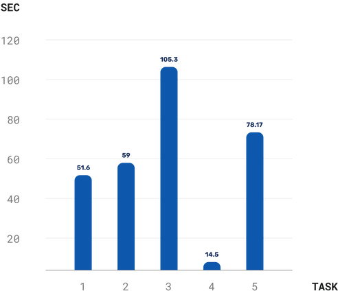
Time on Task shows how long participants take to complete a specific task. Generally, a longer time spent on a task may indicate a higher level of difficulty in completing it.
-
The results indicate that Task 4 – Go back to Homepage – was the easiest to complete overall, with an Average Time on Task of 14.5 seconds (0.24 minutes).
-
In contrast, Task 3 – Purchase the 'Forecast Completion Date' student letter – was considered to be the most challenging, taking an average of 105.3 seconds (1.76 minutes).
-
The remaining tasks, ranked from the second least to the second most challenging, are:
Task 1 – Check the courses enrolled in this semester (51.6 seconds - 0.86 minutes),
Task 2 – Make payment of the tuition fee (59 seconds - 0.98 minutes), and
Task 5 – Check the graduation dates (78.17 seconds - 1.3 minutes)
Affinity Map

In addition to the quantitative metrics outlined above, our team conducted Affinity Mapping sessions, based on the Post-survey Interview results, to gain a deeper understanding and identify recurring patterns of user behaviour. These sessions allowed us to assess the quality of users’ interactions with WES by examining their thoughts and feelings during testing.
The analysis revealed three key categories of insights among WES users:
Frequent Issues
1
-
Unclear content
-
Unclear typographic hierarchy
-
Confusing information hierarchy
-
Navigation challenges
-
Accessibility issues
-
Other minor errors
User Efforts
2
-
Partial task failures
-
Success with notable effort
-
Following designated navigation paths
Improvement Suggestions
3
-
The UI aesthetic should be improved as it current look is outdated.
-
The time required to become fully familiar with the system should be reduced, as it currently takes too long for first-time users (1–2 hours).
-
Information about the available services on WES should be more visible and accessible, as some users (first-year students especially) are either unaware of their existence or struggle to find them.
-
Enhance the information architecture by rearranging and re-categorizing certain content, and improving navigation, viewing, and selection interactions to make the experience less confusing.
Key Quotes
from participants
USER 6
“The user interface (UI) should be improved:
the font, text, hierarchy, everything.
There are a lot of texts everywhere. If I want to find something, I must read through everything with an unclear hierarchy. That’s why it’s very hard to navigate on the web page.”
USER 2
"I am familiar with this system, but it is complicated for students who just started the first semester. We had to learn how to use this system, and it took me one hour or two to get to the level of familiarity I have now."
USER 3
"Normally, the logo would lead to the home page.”
USER 2
“Adding with instructional videos, less text, refining the hierarchy, description for links and using icons can be beneficial.”
USER 6
“I would like WES to provide unit suggestions for each course.
It could be something like a filter to choose Faculty, Courses, and Specialisations and then suggest the units to choose from.”
Detailed Findings

Task 1 - Enrolment
Check the units that you have enrolled this semester
Scenario: You want to check which units you have enrolled this semester

Key Discoveries
The average time to complete the task is 70 seconds.
Most users can easily access the enrolment through the “Enrolment / Re-Enrolment” section on the homepage or the “Enrolment / Re-Enrolment” tab on the left-side navigation bar.
However, when viewing the content to see the enrolled units, there is too much information that confuses users.

The "Whys"
-
There are 2 options to view Enrolment on the homepage (highlighted areas below)
-
The lack of clear typographic hierarchy makes seeing content at a glance challenging
-
Too much information in one long table makes users have to scroll and scan through everything to check the units

Potential Consequences
-
Redundant access options on the homepage might confuse users, leading to longer task completion times and a less intuitive experience overall.
-
The issues identified may cause inefficiencies and frustrate users. The overload of information in a single table makes finding specific content, such as enrolled units, difficult.
-
The lack of a clear typographic hierarchy adds to this challenge, making it hard for users to quickly grasp the content.
Task 2 - Payment
Make payment of the tuition fee
Scenario: You want to pay for the tuition fee and check if the payment is received

Key Discoveries
Experience with the Payment task can be described as evenly divided, with 50% of our users reporting ease in interacting and navigating to the tuition fee page. In contrast, the remaining 50% encountered challenges primarily related to navigation.

The "Whys"
Those who found it difficult encountered challenges primarily due to deficiencies in page navigation, mainly because of unclear descriptions and content hierarchy.
This underscores the importance of addressing navigation-related issues to enhance overall user satisfaction.
Potential Consequences
For the 50% of users who encountered difficulties, navigating may cause the interactive experience with WES to be frustrating and dissatisfying, which can reduce user retention.
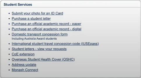
Task 3 - Student Services
Purchase the “Forecast Completion Date” student letter
Scenario: As an undergraduate student applying for a postgraduate scholarship at Monash University, you must confirm your graduation date as part of the application process.

Key Discoveries
50% of participants failed to complete this task. Most of them said that they did not expect the "Forecast Completion Date" student letter to be placed in the Student Services section and that it was difficult to find the "Student Letters" keyword on the website.

The "Whys"
-
Most participants had never heard of or knew about the Student Letters service.
-
The lack of clear information and typographic hierarchy in the whole page and too much information (text) in an area (container box highlighted below) makes seeing content at a glance challenging
Potential Consequences
-
The difficulty in accessing the student letter may lead to frustration and dissatisfaction.
-
Users may abandon the task, reducing overall user retention.
-
Users may lose trust in the university's services due to the time and effort required.
-
The lack of awareness about the service could further discourage engagement with university resources.
Task 4 - Homepage
Go back to Homepage
Scenario: You want to go back to the homepage to see other sections.


Key Discoveries
There was a significant variation in the time participants spent on this task, with a 50% difference between the fastest and slowest users.
Most participants successfully found the correct entrance and returned to the homepage within 10 seconds. However, one-third of the participants (2 out of 6) took 40 seconds, and one participant failed to complete the task.
This highlights a critical usability issue in one of the most fundamental tasks—navigating back to the homepage—that needs improvement.
The "Whys"
-
Most participants were confused by the logo’s placement and function. Universally, clicking the top-left logo (highlighted area below) typically returns users to the homepage, but in this case, it redirected them to the my.Monash page, which is not WES’s homepage.
-
The WES homepage lacks clear guidance or warnings for new users, making navigation less intuitive when the expected universal pattern does not apply.

Potential Consequences
-
Increased navigation time: Participants may need to spend extra time returning to the previous page or WES homepage after being redirected to the my.Monash site.
-
Workaround reliance: Some users might resort to using their browser’s search or history functions to bypass the confusing system, highlighting its inefficiency.
-
Diminished trust: These issues can lead to user frustration and dissatisfaction, ultimately undermining trust in and engagement with the university's services.
Task 5 - Course Progression
Check the graduation dates
Scenario: You are curious about when your graduation period begins and ends

Key Discoveries
-
There is a significant discrepancy in task completion time between the fastest and slowest users, ranging from 5 seconds to 170 seconds (~3 minutes).
-
Users who completed the task in 5 seconds had prior experience with WES, while unfamiliar users took nearly 3 minutes to navigate successfully.
-
Half of the participants took approximately 1 minute, indicating a general difficulty in task completion.
The variation in completion times highlights usability issues and inefficient navigation, which should be improved to create a more intuitive experience, especially for new users.

The "Whys"
Users, especially new ones, were unsure whether 'graduation dates' were included in WES.
Although this information was located in the Course Progression section within the sidebar, users did not naturally find it there. Instead, they searched in the top navigation menu, which is typically expected to contain the site’s main categories (including Course Progression), but in this case, it did not. (highlighted areas below)
This highlights a lack of intuitive discovery and misalignment in navigation expectations, as the information's placement does not follow universal UX patterns.

Potential Consequences
-
The learning curve is steep, with some users struggling to efficiently complete the task, requiring extra time and effort. Instead of quickly scanning the site to locate information, users must manually browse through multiple options and sections.
-
The inconsistency in completion times also highlights low usability and inefficient navigation, potentially leading to frustration and reduced engagement with the platform.
Data Analysis
Interpreting User Behaviour
Task Success/Failure Matrix
The matrix reflects how smoothly participants completed tasks by analyzing their behaviours, emotions, and comments while interacting with WES.
Additionally, the scoring indicator system provides further insight into task success based on these qualitative cues.


Measuring Ease of Use
Severity Rating
Severity = Average Time On Task + Success/Fail Rate

Task Difficulty Ranking
The task difficulty ranking is based on severity ratings, ordering tasks from the most challenging—those with the highest pain points and user frustration—to the least.

Evaluating Overall System Usability
SUS (System Usability Scale)
In the final stage of data analysis, we used the System Usability Scale (SUS)—the most commonly used questionnaire tool for measuring usability. Participants were asked to fill out an online SUS survey template after each usability testing session.

The template consists of 10 questions, each rated on a 5-point scale from Strongly Disagree to Strongly Agree, and users are asked to rate the following statements:
-
I think that I would like to use this website frequently.
-
I found the website unnecessarily complex.
-
I thought the website was easy to use.
-
I think that I would need the support of a technical person to be able to use this website.
-
I found the various functions on this website were well-integrated.
-
I thought there was too much inconsistency on this website.
-
I would imagine that most people would learn to use this website very quickly.
-
I found the website very cumbersome to use.
-
I felt very confident using the website.
-
I needed to learn a lot of things before I could get going with this website.
Once all participants have completed the survey, the SUS scores will be converted as follows:
-
Strongly Disagree = 1 point
-
Disagree = 2 points
-
Neutral = 3 points
-
Agree = 4 points
-
Strongly Agree = 5 points
The SUS score for each survey is calculated using the following formula:
-
X = [Sum of the points for all odd-numbered questions] - 5
-
Y = 25 - [Sum of the points for all even-numbered questions]
-
SUS Score = (X + Y) * 2.5
The SUS score results are presented below, along with a guide to evaluate WES's overall ease of use, providing a measurable, quantitative assessment of its effectiveness, efficiency, and user satisfaction.


The results show that WES's average SUS score is 27.5 (<51), with all individual participant ratings also below 51, receiving an 'F' grade. This indicates that users perceive the system's usability as 'Awful.'
Usability Insights Summary
Based on the qualitative and quantitative evaluation of WES usability, the results indicate a significantly low ease-of-use rating. This not only impacts efficiency and effectiveness but also leads to user frustration and diminished trust in Monash University's service system. Therefore, addressing these issues is crucial to improving user satisfaction, streamlining interactions with university resources, and fostering greater engagement and trust in WES.
As the student designer team of WES, we recognise these problems and align with user feedback from the final post-survey interviews. The most frequent usability challenges include: unclear content, unclear typographic hierarchy, confusing information hierarchy, navigation challenges, and accessibility issues.
To enhance usability, the following general improvements should be considered:
-
Modernize the UI design.
-
Reduce the learning curve by UX optimisation for faster onboarding.
-
Increase visibility of available services as many users, particularly first-year students, are unaware of existing services or struggle to locate them.
-
Improve information architecture – content should be better structured, re-categorized, and reorganized to enhance navigation and reduce confusion.
Key Recommendations
Issue #1: Outdated and Inefficient UI Design
The primary area requiring immediate improvement is WES’s user interface (UI), which is notably outdated—particularly in typography, visual cues, content display, and overall layout.
-
Users struggle with a cluttered interface due to an excessive amount of text and minimal typographic hierarchy.
-
The layout is overly dense, with large blocks of information displayed in long tables, making it difficult to scan and navigate.

Recommendation #1: UI Revamp Aligned with Monash University Branding
A UI overhaul should adhere to Monash University’s branding and visual guidelines to optimize existing resources while maintaining a consistent and cohesive look and feel across the university’s digital platforms.
Here are key elements to leverage in the redesign:
-
Typography – Utilise the predefined typographic hierarchy for improved readability.
-
Colour Palette – Apply Monash’s existing colour system with clearly defined usage and functionality.
-
Icons – Use the available scalable icon set to maintain consistency and enhance recognition.
-
Other Digital Guidelines – Implement recommended spacing, responsive layouts, and accessibility considerations for an optimized experience.

Conclusion
Based on the feedback obtained from the WES usability test, it's evident that while some experienced users find interacting with the system manageable, it presents a significant challenge for new students. The learning curve can be steep, requiring a substantial time investment to gain a reasonable level of familiarity.
-
The recommendations for improvement centre on providing instructional indicators, such as tooltips or videos, reducing text density, refining the hierarchy, incorporating clear descriptions for links, and employing more icons to enhance user understanding.
-
Additionally, ensuring that the logo consistently leads to the homepage would improve user navigation.
-
A notable suggestion involves implementing a unit suggestion feature, allowing students to filter and select units based on faculty, courses, and specializations. This could significantly assist students in navigating the available course options.
-
The overall user interface (UI) demands a comprehensive overhaul, particularly regarding font, text, and hierarchy. The excessive text and unclear structure make navigation difficult, underscoring the necessity for a more streamlined and intuitive design.
Implementing these recommendations would greatly enhance the user experience of WES, making it more accessible and efficient for all users.